
Introduction
We launched FastRuby.io , our first productized service, back in June 2017. At the time, we had been doing Ruby on Rails upgrades since 2009, for our own products and client projects . We decided to package these upgrades under their own domain through FastRuby.io .
Now, over two years later, we have completed over a dozen Ruby on Rails upgrades through FastRuby.io and are seeing consistent interest in our upgrade and estimation services.
We decided that it was time to refresh the look and feel of the website. We worked with Verónica García , UI Designer and Front End Developer, to complete the website redesign. In this post, we talk to Verónica about her creative process and how she approached the redesign challenge.
Emily: Thanks for chatting with us Verónica! How did you begin thinking about the redesign of the FastRuby.io website?
Verónica: My decisions began when I reviewed the old website and detected which parts were working and which were not. I then looked for references to get ideas of how some of the UI challenges the website was facing could be solved.
Some references I used included The Design Project , Depfu and Zeit .
Emily: What did you feel were the main issues / pain points with the previous website?
Verónica: The website had a very long single home page with a lot of content. It also had an old look and feel. I knew I would need to adjust the design as well as find a better way to display the website’s content.
Emily: How did you try to solve these issues?
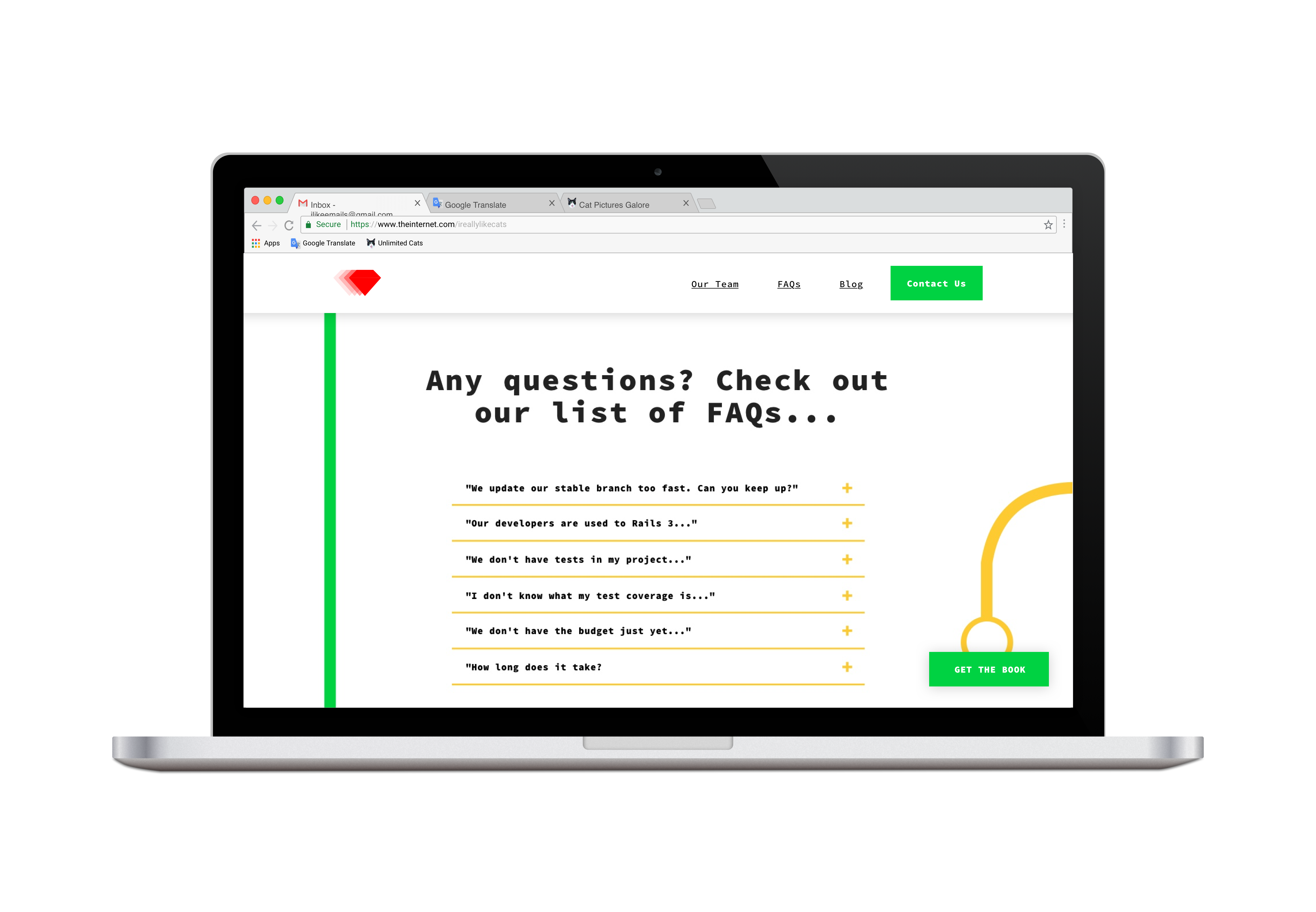
Verónica: I had to redo the visual hierarchy on the home page and think of ways that I could show the content in a new dynamic and partial way. These included accordions, carousels and more.
For example, I used an accordion to better display the FAQ’s:
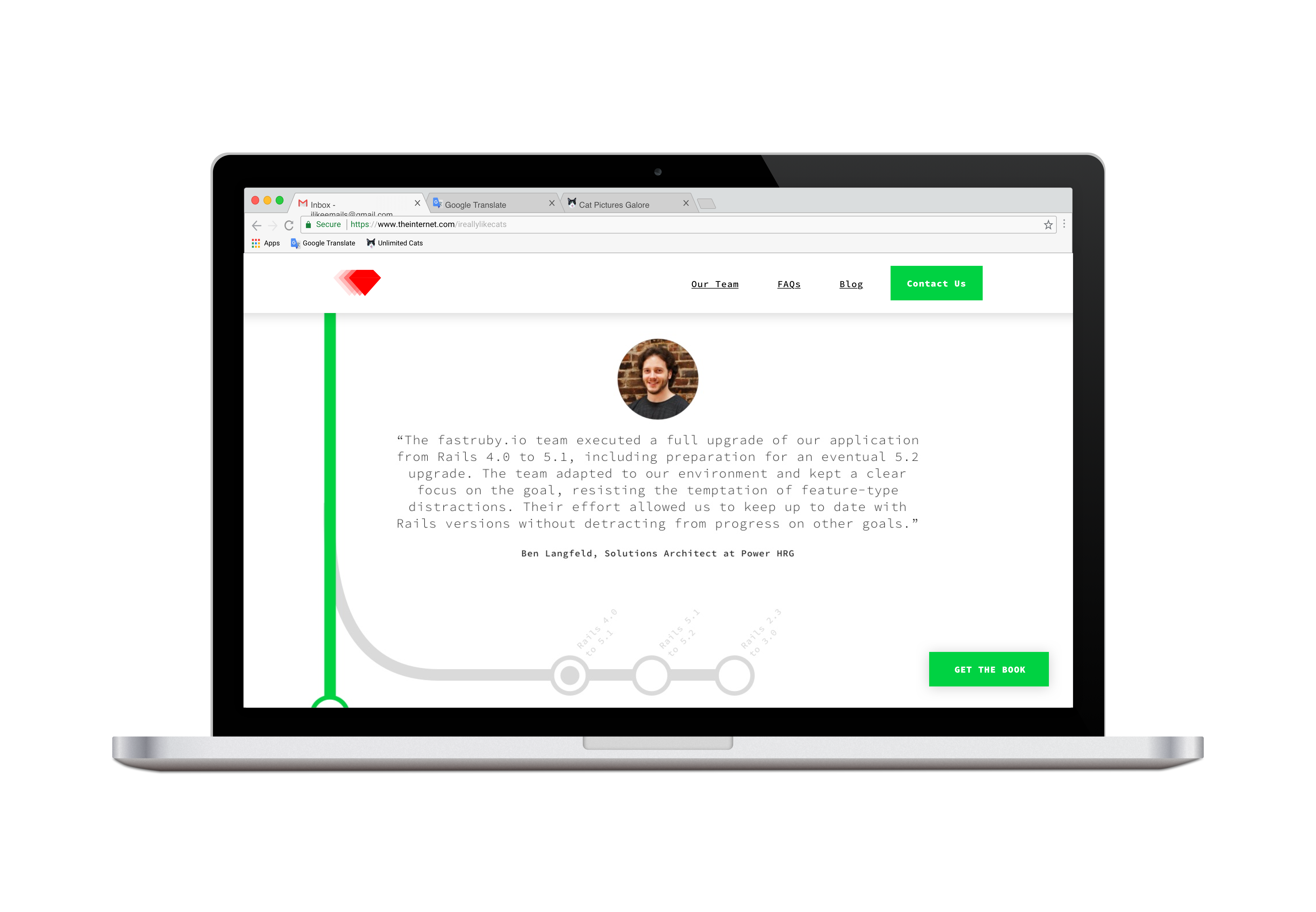
For the “Our Clients” section of the page, I used a carousel so that users could scroll through client quotes easily:
Emily: How did you make design decisions for the website? For example, choosing colors, fonts, page layout, etc.
Verónica: I used the first impression I got from looking at references and the old website to create mockups. I wanted to rectify the things that weren’t working and add things that would improve the website. I always try to make my designs simple, clear and minimal.
In this particular project the idea was to change the current dark theme to a lighter one with a lot of white space - the opposite of what we had. I looked for a “sans serif monospace” font family, which has good readability and is associated with the dev world.
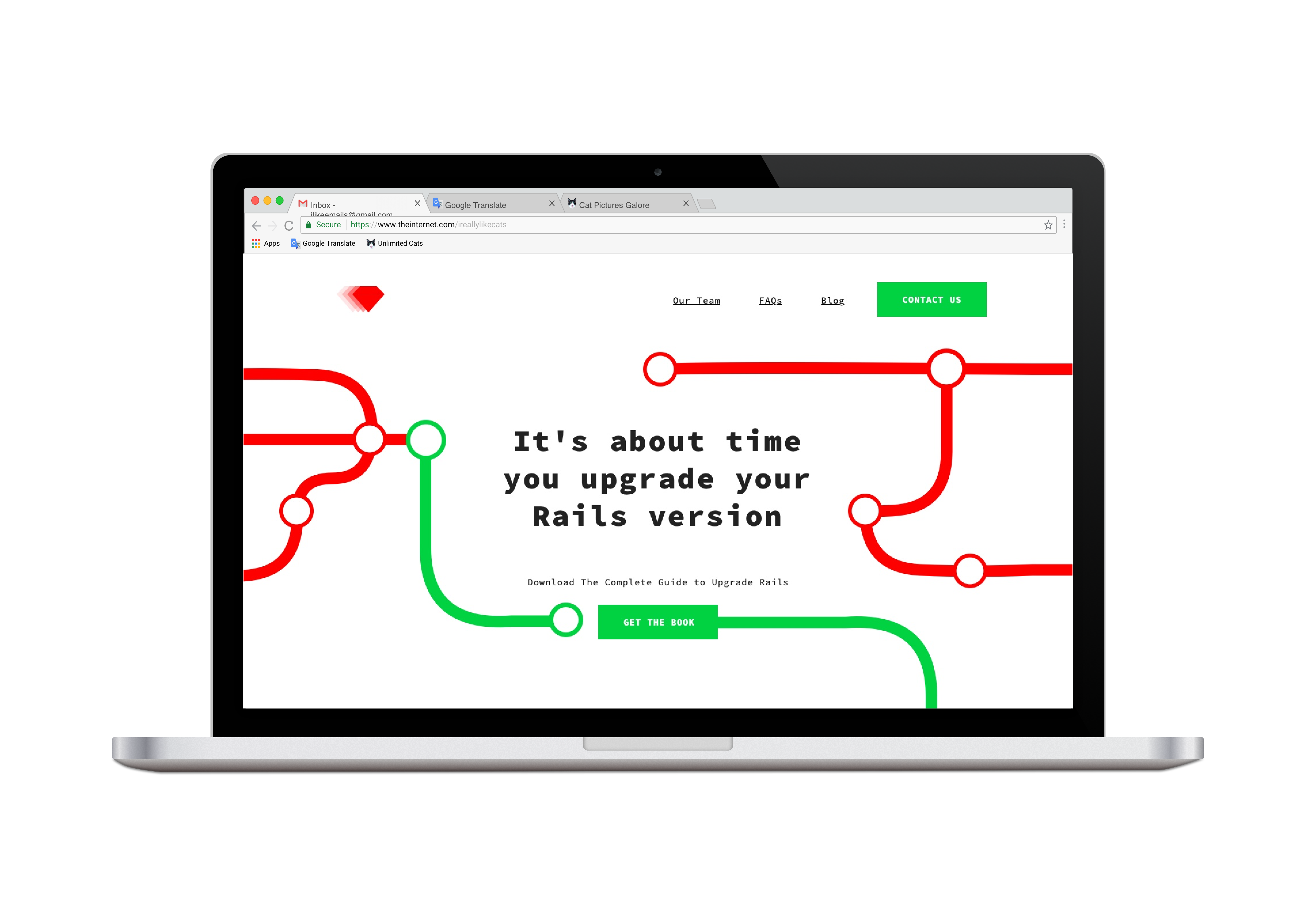
We kept the same color palette, but prioritized the green color over red to give a more positive impression.
The first section of the website showcases this improved color palette well:
Other miscellaneous notes were to add in references to Rails (as opposed to Ruby) and some branches from Github to make it clear that the website is for a software engineering company. I also had a note to add some color to the website and to break up the staticity of the homepage.
Emily: After you made the design decisions, how did you plan out the website? Did you create any mockups or wireframes?
Verónica: After taking a good look at the references and analyzing the old website, I jumped into creating a quick handwritten wireframe to organize the different blocks of content.
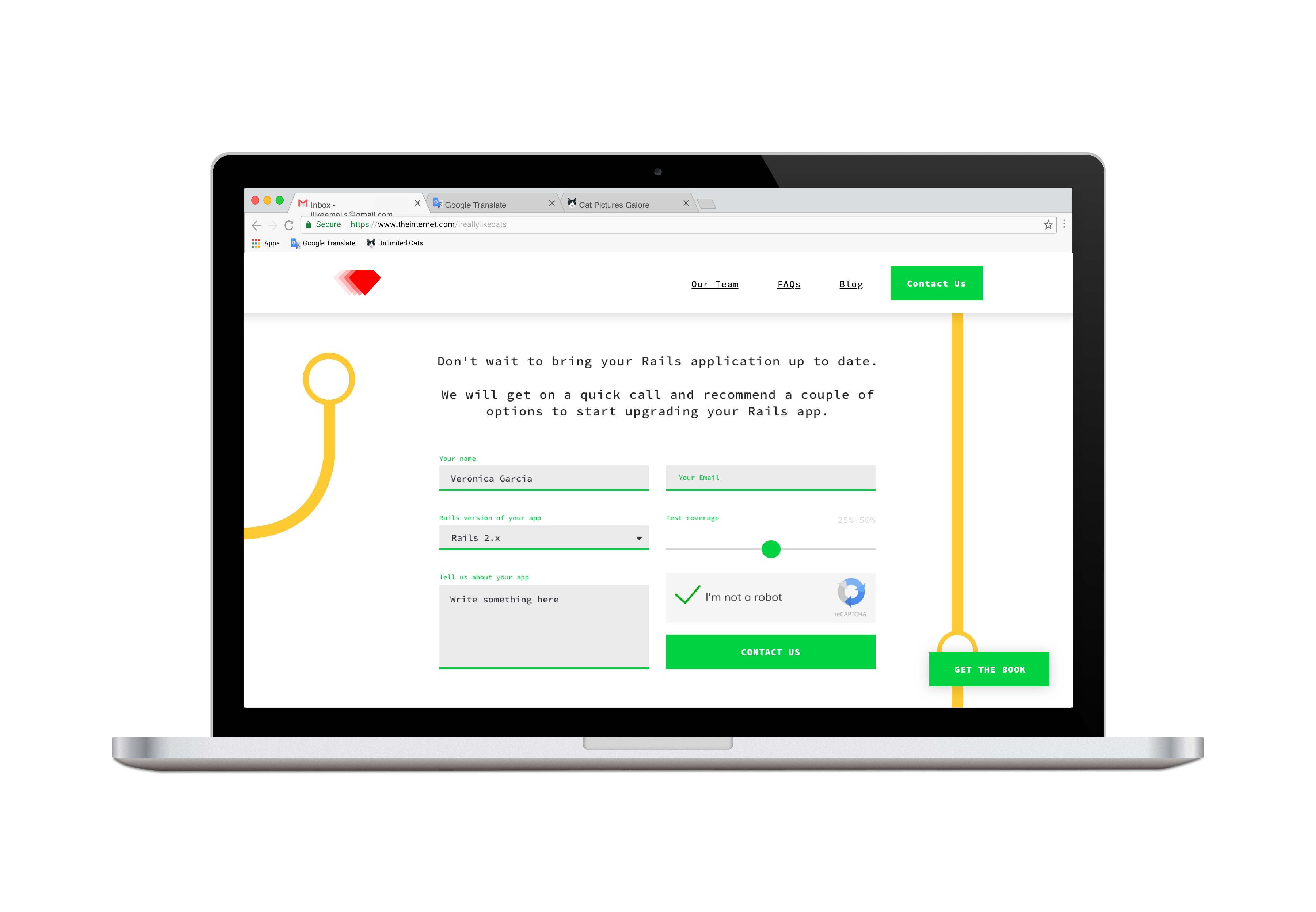
I then continued with the creation of some assets, such as inputs, buttons, typography blocks, color palettes, etc. I then created mockups in Sketch , taking into account all of the different viewport sizes.
Here are some of those mockups:
After creating the mockups, the team reviewed my work to test the interactivity and look and feel of the website. Once they were done, I used their feedback to make the necessary adjustments to the design. I then started to code the website.
Emily: How would you describe the new FastRuby.io website
Verónica: It is a clean and minimalistic website, where you can access the content in a straightforward manner.
Redesigning the FastRuby.io website has been a fun and interesting process, and we are really happy with the results. What do you think of the website’s new look and feel? Leave us your feedback in the comments.